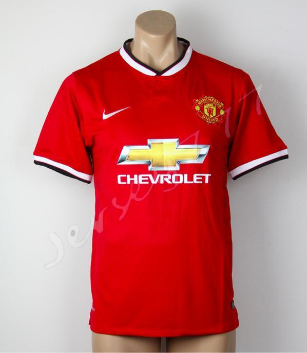
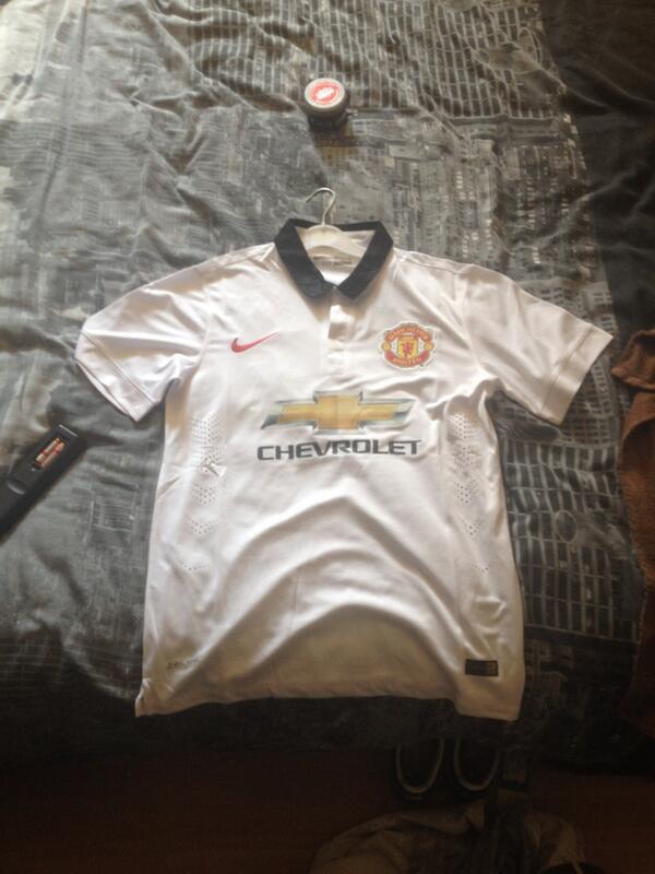
Manchester United’s 2014/15 is almost set for release in the United Kingdom and through-out the World. But, as both Nike and new sponsors Chevrolet leak teasers regarding the new design, over the past few months there have been a number of rumoured designs and pictures floating about this internet.
Now, more pictures have sufficed that co-inside with the ones that we leakedon RedMancunian a few months back revealing the design and Chevrolet sponsorship.
One of the leaks has come direct from Nike themselves, as it seems the release date in their Saudi Arabia store had been bought forward.
Take a look at the latest Manchester United home and away kits and let us know what you think in the comment section below.


15 replies on “PICTURES: What do you think of Manchester United's new kits?”
Poor effort from Nike. I know they may not have a day with the sponsor but the collar is bad and the away looks like a normal t-shirt. They are capable of making good kits but they seem to give us the rejected designs.
Man united really need right back since rafael always in injury nd is only him we ave dat play dere very wel, we also need shap winger cos ashley young is d worst winger united ave.
Really like the retro feel of the home shirt, reminds me of late 80’s
Like them both they are cool but least when we move to adidas they will be really awesome
Our kit is not a problem. D main problm is how to recruit a fresh players in our team. Firstly i appreciat our two signin,tanx to Ed woodward but stil we need to sign anoda midfielder to compliment d effort of herrera and also two winger wit central defender. Vaal Gal shld sellin Asl young aslo, d guy is worst and waste asset for united.i dot wat to see him playin for unitd next season.
I’d be perfectly fine with a big ‘Chevrolet’ text ont the chest (it would actually look more stylish than ‘Aon’) but with the logo there it just looks really cheap!
Come on, i wont buy that model!
Yeah i like them they look like the late 80s adidas kit by the colar and sleeve cuffs but they could be pink or lime green will still look better than merseyshites warrior kits 😉
Absolutely shockingly bad and tacky looking, there is no way i would put that shirt on my sons back, it’s more like a cheap promotion shirt than the football shirt of one of the most famous football club in the world! Terrible.
Away kit is nice and plain. Haven’t made my mind up on the home shirt, would be better if it just had the outline of the Chevrolet badge I think.
Terrible
Home kit looks perfect but away kit need to have same design compared home normal t-shirt
[…] If you have not seen the first teams new home kit for next season then feel free to see it here. […]
Not payin £50 for a shirt
robbing. B******s
I hate the Big Chevrolet logo makes it look childish… Please make a modern classic kit and not the kits my grate grand father wore in the 60’s
How cheap looking, ironic really considering how much they cost.