The end of the footballing season is upon us and it brings an end to the Manchester United shirt sponsorship from insurance group, AoN.
Manchester United’s new sponsorship deal is with American car giants Chevrolet, who have done a deal to be the clubs sponsors from the 2014/14 season until the end of the 2020/21 season in a deal which is worth £358-million for the club.
Man Utd Kit 2014/15

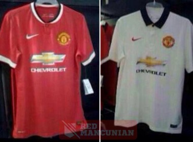
As you can see from the rumoured to be leaked pictures above, the new Manchester United home shirt is a simple design with a white and black trim on the color and sleeves with a gold Chevrolet logo & text.
Better pictures of Manchester United’s home and away shirt:
The new away shirt is also a simple design from shirt suppliers Nike, a plain white shirt with black color and three buttons at the front.

The Manchester United 2013/14 away kit, the blue one, will then become their third kit for the 2014/15 season with Chevrolet on the front, also in gold.
What do you think of these Manchester United leaked shirt designs? Comment in the section below.


28 replies on “PICTURE: Manchester United 14/15 Home & Away Kits Leaked ”
That just looks awful.
Really hope this is not legit as I will not be purchasing it.
They’re ugly man
[…] Mancunian has posted a photo of what apparently are Man United’s new home and away kits for next […]
I really hope Adidas to bcum our new kit sponsor coz Nike designing crap off late.
[…] to diehard Manchester United fans site Red Mancuncian, the following kits are what the Red Devils will be wearing next […]
The kit looks atrocious. It looks like a cheap knockoff. To plain for a team of that magnitude.
The problem of the kit is just for how we can get money where ever we have fans. But in the case of the new kits it looks not good but it doesnt a matter for me i preffer Adidas then Chevrolet. We need money from American company and also from German company let us live it flexable
it looks absolutely GASH! I like this one better and the chevrolet sign is just right http://surabayafootballstore.com/wp-content/uploads/2013/04/eeg.jpg
They look quality!!!
They re freacking me out
So pretty much it’s copying this season’s man City home kit and keeping there home jersey but changing it white
Too plain
I think these are great looking. Simple but stylish.
Bad looking
Horrid
Those kits look absoulety pathic
Would look much better if the chevy logo was just a white outline and white text like the vodafone sponsorship of the early 2000s.
They are not nice at all…they are jux like jerseys of the 90’s
The kit itself is nice, the Chevy logo though is horiffic!
The kits would look amazing with just the “Chevrolet” text on them.
bad quality should do a bit better really!!!
I don’t think anyone will want to sign for united with those horrific shirts!!!!!!!!!!!!!!
The jerseys are not fine at all…they are just like old jerseys of the 90′s
They should make a nice better one
jolley
I look on the bright side, we’ve had worse.
you know what the previous season kit was better than this
just like 90s
AAAAWWWWWWWWWWWWWWWWWWFFFFFFFFFFFUUUUUUUUUUUUUUULLLLLLLLLL!!!!!!!!!!!!!!!!!!!!!!!!!!
They are simple and retro but i like them. I bet you guys that the kit would better look on person than without a person. So don’t complain that it is awful it’ll actually look pretty descent on you.
I’ll buy it straight away when it hits the market.
seriously horrid lookin & looks old school…I like old school but NIKE cant design shit when it comes to old school style…MAN UTD should seriously think bout changin to the kings “ADIDAS”….they know how to design jerseys be new or old school…